48% of shoppers in the US are utilizing online experiences for their grocery needs. As more consumers turn to online shopping, it was imperative for Freshmarket to focus its efforts on creating an engaging, and accessible experience for all Freshmarket consumers.
One of the main reasons why people don’t shop products online is they want to inspect its quality or they have had a bad experience ordering online. To help customers get their trust back I introduce Live Video Shopping, which gave them the ability to call staff in Freshmarket to get help find what they are looking for by presenting and comparing products during a live video call.
providing filters, proper categories, a friendly payment process, easy navigation, improved order, and delivery process, they also had the chance to save time and have a satisfying experience.
type
E-Commerce Web
DELIVERABLES
User Research Persona sitemap Affinity Map User Journey Map Wireframes Prototype High-fi Mockups
On my first attempts, I sent an online survey to many people, while conducting interviews with more than 7 Individuals. I designed empathy maps to know more about my user group, their needs, and their problems. My primary user groups were busy adults who didn’t have time to go shopping. My secondary user groups were adults who preferred to stay home and delivered their shopping lists due to the pandemic to destress themselves.
The main problem which most users had in common was a lack of time to go shopping due to their demanding jobs. Other problems included obligations, interests, or challenges which made it difficult for them to go shopping in person.
Customers
Support
Delivery
Payment
Could you please introduce yourself?
If the product you wanted was not available, you prefer to …
When is your ideal delivery arrival time?
what is you preferred payment method?
Could you please talk about your experience buying fresh produce from an online market?
How do you prefer to know about promotions or discount in an online shop market?
Does receiving your order on time and with proper packaging encourage you to buy online?
Have you ever felt frustrated? Could you talk me through your experience?
What does make your online shopping experience desirable?
Creating a vision
Following the interview, I gathered and formalized my findings into personas to communicate the findings easily and to determine the functional scope of my product.
Goals:
Have a healthy lifestyleHave her own businessHave more income
Interests:
Tech Expos Cooking Sketching Shopping
Frustrations:
No Work/Live balance Maintaining Health Financial Stability
Motivations:
Saving money and time Buying and consuming organic products
Entertainment:
Sports Sketching Hiking Yoga
How it works?
I designed the sitemap to outline the relationship between pages in order of importance.
From findings to design solution
To really bring these routes to life, I used Figma to create mid-fidelity wireframes to start to bring together screens and flows.
Taking the wireframes, I then worked on creating a mid-fidelity prototype, to use for usability testing.
UI Style Guide
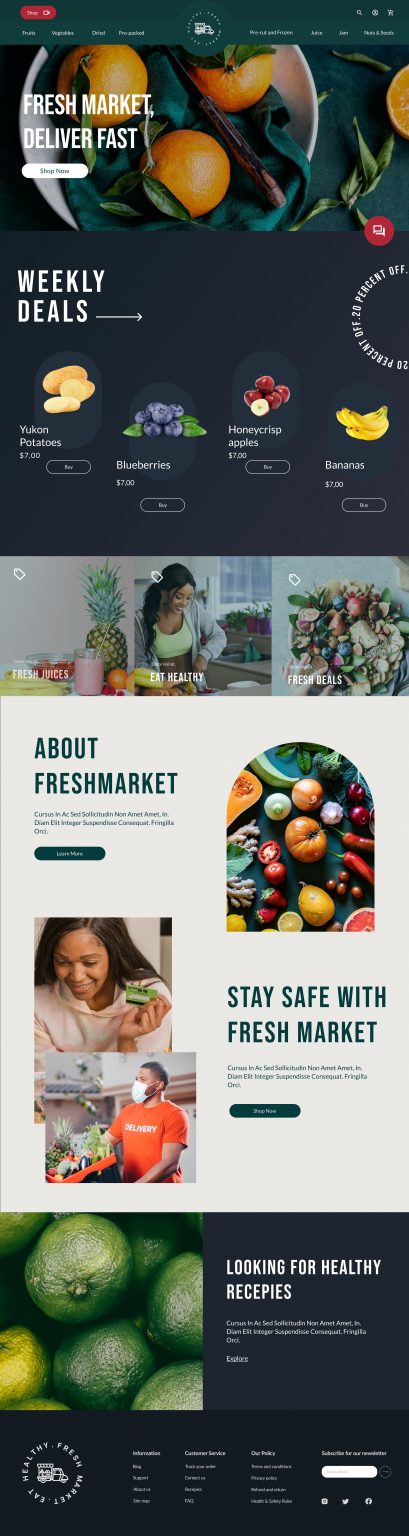
My style sheet for the fresh product website prioritizes a modern, inviting aesthetic. A carefully curated color palette, featuring shades of green for freshness and vibrant accents for energy, sets the tone. Clean typography ensures readability, while captivating visuals showcase the products’ quality. With a clear layout and responsiveness across devices, I aim to deliver a seamless, visually appealing browsing experience that inspires exploration and engagement.
Synthesizing goals from my research served as a lens through which I consider how Freshmarket website should feel. To encourage users to buy from Freshmarekt, I put my focus on the importance of aesthetics and tone of voice in the experience. I opted for clear, legible typography and choosing colors with high contrast to increase readability and accessibility.
I went through many rounds of usability testing, let the users play with the clickable prototype to go through basic tasks, take notes and implemented the changes.
Make it accessible and desirable
According to the World Health Organization (WHO), over 2 billion people live with a disability, 20% of whom live with great functional difficulties in their day-to-day lives. I followed the WCAG 2.0 to make my website more accessible and usable for people with disabilities so they find their experience desirable and enjoy shopping on Freshmarket.
Live Video Shopping
Integrate video shopping to Freshmarket website to maximizing sales and satisfaction, specially for disabled people.
Audio Assistant
Using Audio assistant allows people to search more efficiently voice commands while it can be used to provide accessibility, to physically disabled and learning disabled, dyslexic and visually disabled individuals.
Photo Assistant
I introduced Photo Assistant to help people uploading images.
Hierarchy
I used headings with different sized text for clear visual hierarchy.
Results
Both secondary and primary research were key to guide me through my whole design process. After walking through the prototype with various users many times, it became clear that there weren’t any major roadblocks in the workflow, but there was still room for optimization.
Overall, this project was a lot of fun and I learnt a lot working on this project, but my favorite part was the time I spend dive deeper into accessibility as I always want to provide a fair and enjoyable user experience for everyone not just an specific group of people.