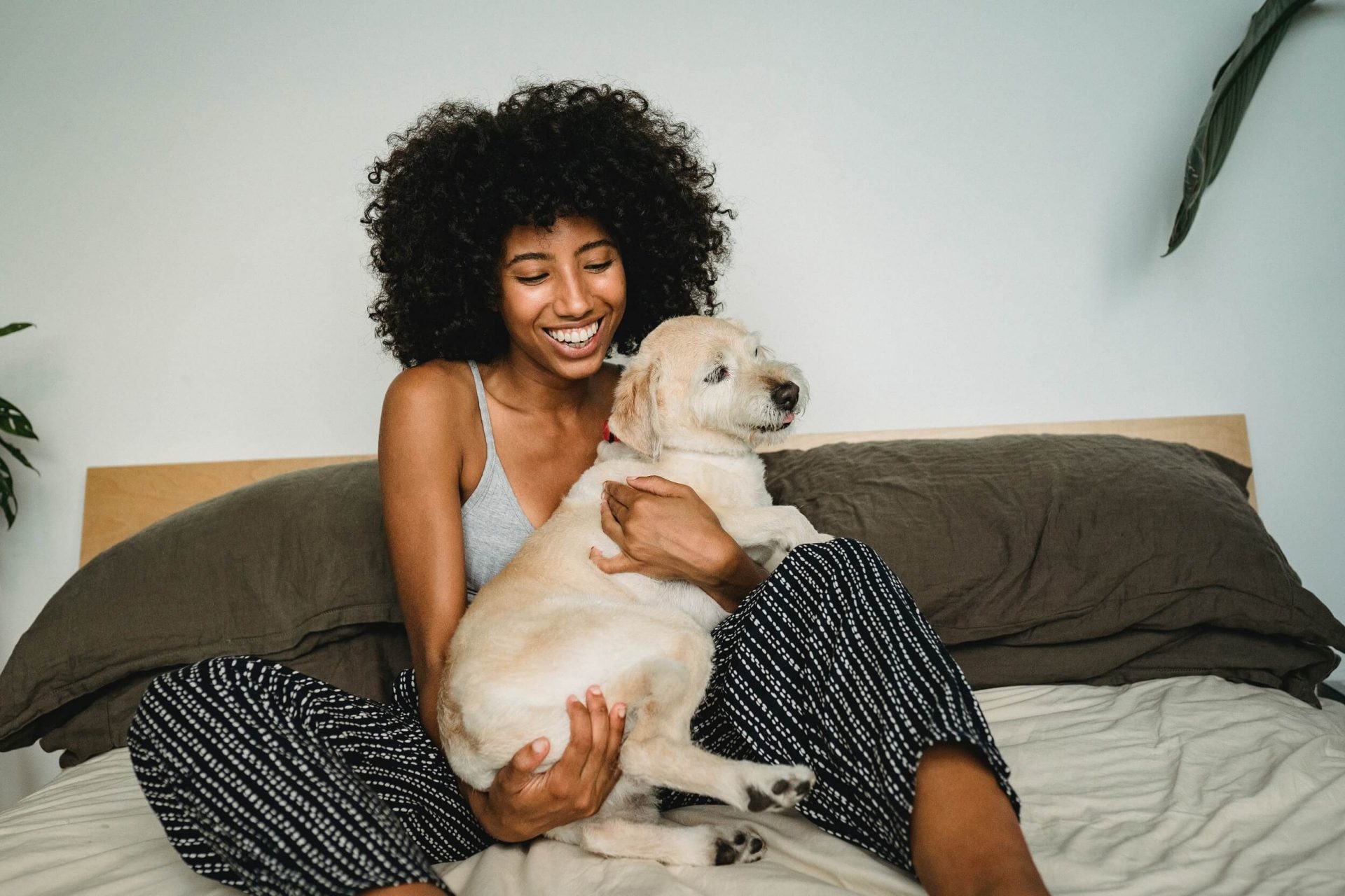
HAPPYBOND, a Canadian-based company, was dedicated to extending the health span of pets and bringing enduring happiness to dog owners worldwide. Recognizing the absence of a regulated digital platform for pet health, HAPPYBOND embarked on the mission to fill this gap by offering a comprehensive mobile app for its customers.
Anja’s story about her dog, Tony, who regained his health through collagen-building formulas, exemplified HAPPYBOND’s commitment to pet well-being. Witnessing such transformative experiences fueled my passion for the project.
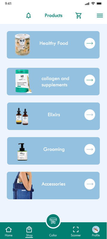
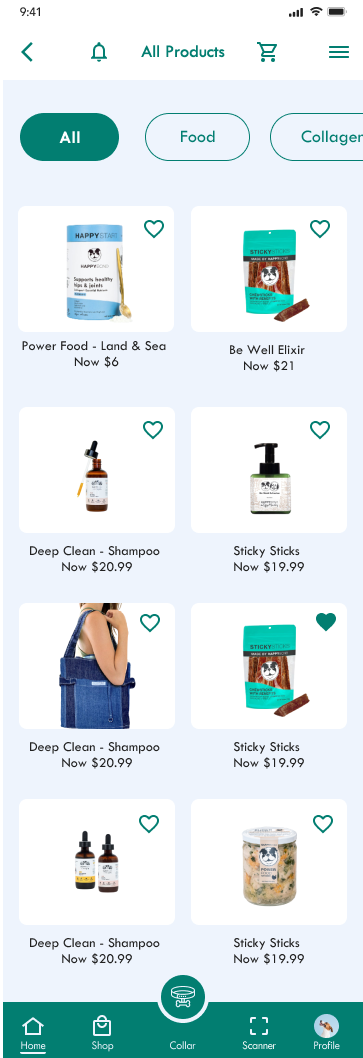
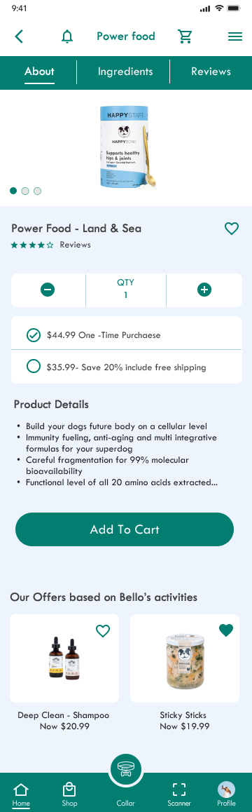
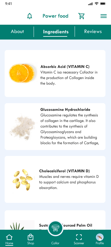
In my role as a UX/UI designer at HAPPYBOND, I led the creation of an intuitive app interface, ensuring a seamless experience for pet parents to access a range of health-centric services for their beloved companions. From simplified membership selection to interactive health tracking and vet-on-demand services, every aspect of the app was meticulously designed to enhance the well-being of pets and streamline the pet care experience for the pet parents.
TYPE
App Design
DELIVERABLE
Competitor Audit Sitemap Personas Stylescapes low-fi Wireframes Prototypes High-fi Mockups
To better understand HAPPYBONDS’ background, market space, and user groups, I started by conducting research.
I conducted interviews with more than 6 people and also design empathy maps to know more about pet parents and their problems. My primary user groups are Adults who prefer their dogs to have a healthy lifestyle, while the secondary user groups are adults whose dogs has some health issues and they are seeking an interactive health tracker and screening test to measure their pet’s vitals and activities.
The main problem which most users had in common was lack of a digital platform for dog owners to be able to shop for their dogs and get reliable information about their health, insurance and so much more in one place.
I learned people like to:
Increase Health-Span of their dogs
Providing their dogs with healthy food, supplements, …
Monitoring pets’ health regularly
Get informed from tailored insurance companies
and more.
Competitive Analysis
After conducting my research, I analyzed HAPPYBOND’s top competitors to evaluate their strengths, weaknesses, opportunities, and threats. This information helped me to understand what the trends are across all competitors, their differences, and why users might choose a particular service or product over another.
Formalize findings into personas
To start getting some ideas about aedifion’s target group, I used everything that I have learned so far from my primary and secondary research to create provisional personas. This helped me to start understanding what their needs might be based on their gains and pains.
Following users' footsteps
As part of the ideation process, I mapped out a user flow to create a visual representation of the steps a user would take to reach their end goal.
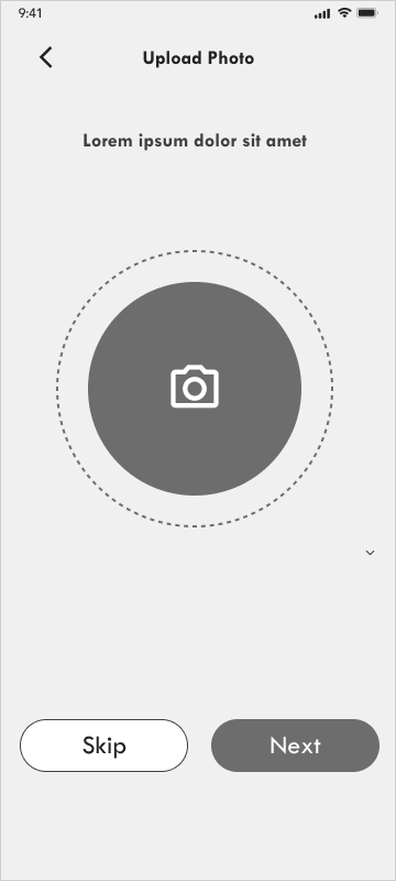
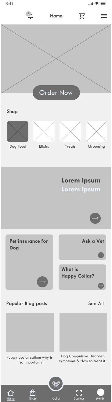
Sketch and wireframing time!
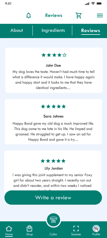
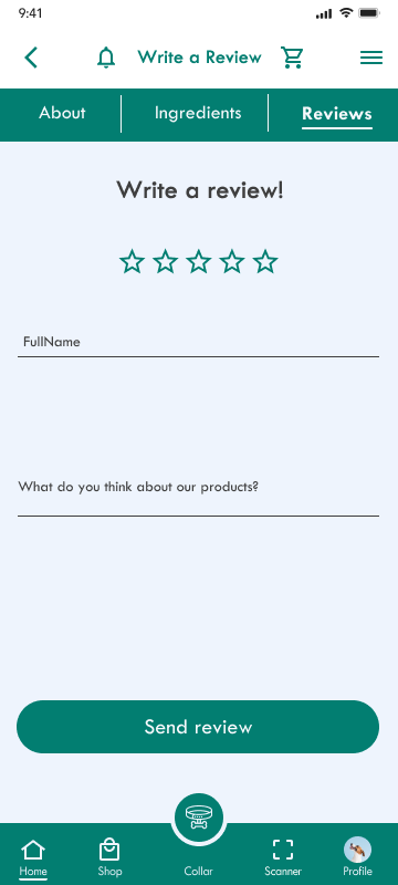
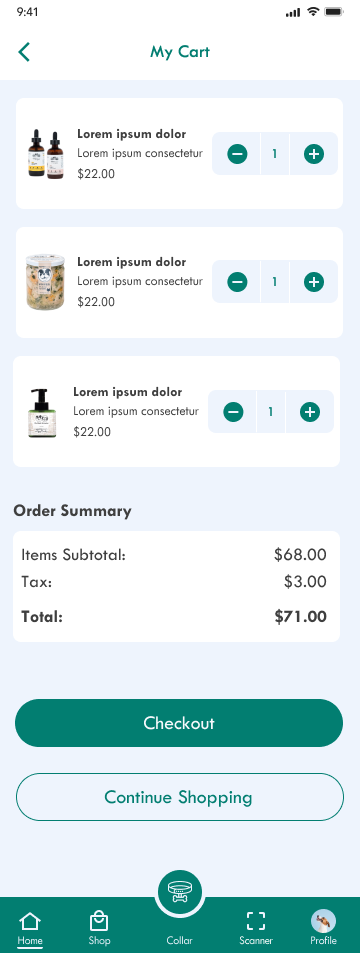
To save time and resources while giving customer a full view of final app I come up with wireframes. I also did some usability testing to evaluate the workflow and get some rapid insights.
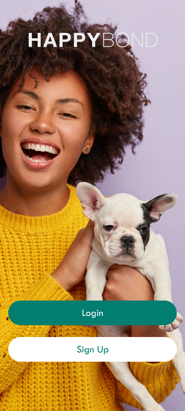
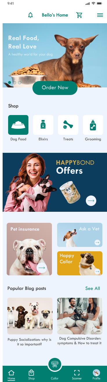
Mockups
Based on the insights from the usability study, I made changes to improve the site’s checkout flow as well as login page. One of the changes I made was adding express checkout. I also added biometric login to provides a more secure and convenient method for authorizing access to private content within the app.
Prototying
I iterated a high-fidelity prototype by applying the usability test. The interactive prototype had provided to the customer.
When accessibility comes into focus
According to the World Health Organization (WHO), over 2 billion people live with a disability, 20% of whom live with great functional difficulties in their day-to-day lives. I followed the WCAG 2.0 to make this app more accessible and usable for people with disabilities especially blind or visually impaired pet parents who relied on their dogs to lead them.
Audio Blog
Audio blog gives readers especially blind and visually impaired people who cannot read from a screen to access to blog content by listening to it.
Touch Targets and Placement
A minimum target size of 44 x 44 px for iOS and 48 x 44 px for Android to ensure that users are able to activate them.
Color contrast
I used a blend of saturated and contrasting colors for more accessibility and visual hierarchy.
Hierarchy
I used headings with different sized text for clear visual hierarchy.
Design system
I made a design system to reduce ambiguity in design, increase the speed at which individual designers can work, and help create a more consistent design throughout the product.
I settled on a page groupings: color and logos; type styles and copy formatting; grids, spacing; and alignment, components; iconography; and further resources.